On a recent flight from Japan to the Philippines, Pydanny and I started coding a new project. The result is AirDragon, a layout and component library for the Air web framework.
We landed on the name AirDragon because it sounded dynamic and airy, fitting for a library meant to help you build UIs that feel light and responsive. Plus, we were on an airplane. Dragons fly, after all.
The goal is to provide an initial component library for Air, letting you think in terms of components, much like the early days of Bootstrap. It's designed to help you build interfaces quickly with sensible, stylish defaults.
Getting Started: The Basics
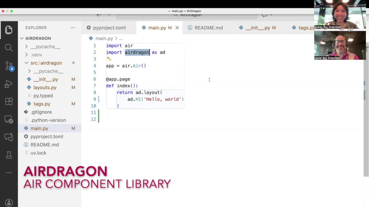
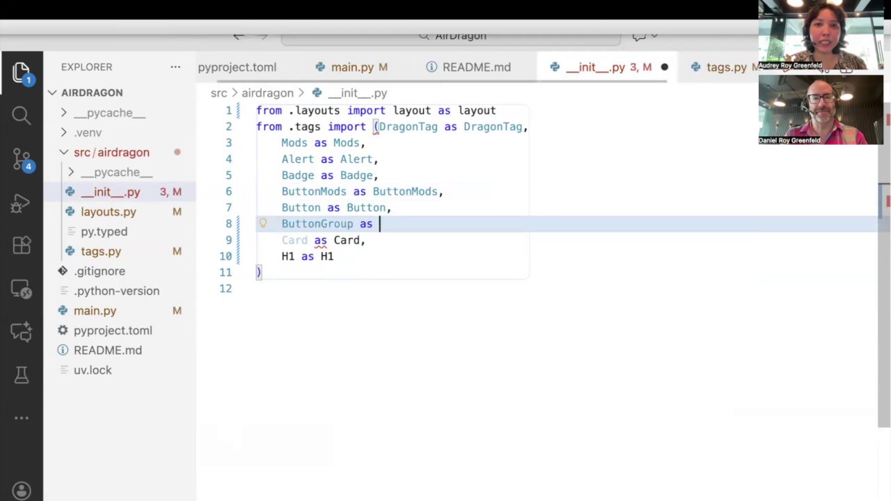
Using AirDragon is straightforward. You import it alongside Air, and you can start using its components immediately. We recommend importing it as the 2-letter ad for convenience. ad is also short for AudreyDanny, so you'll think of us as you code.
import air
import air_dragon as ad

def app(air):
    air.layout(
        ad.H1("Hello World")
    )
Here, instead of the standard air.H1, we use ad.H1. This small change gives us a pre-styled heading element.
Screenshot at [00:20]:
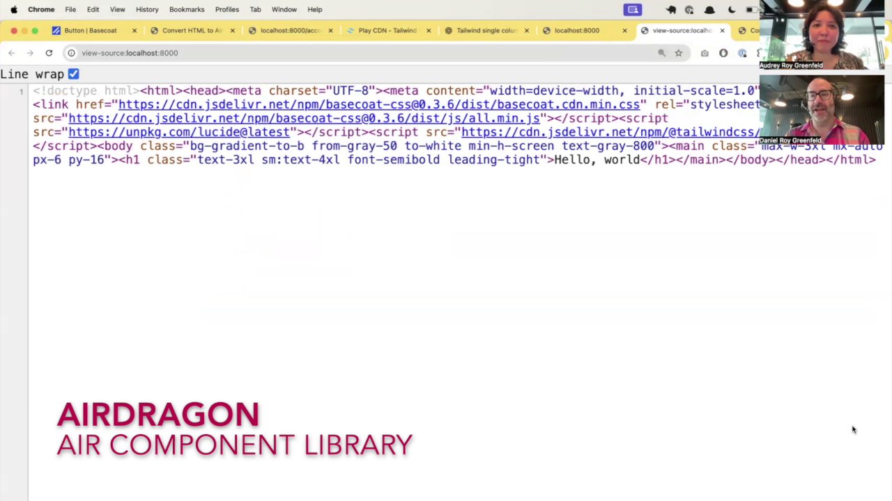
If you open the page in a web browser and then inspect the element, you'll see that AirDragon has applied several Tailwind CSS utility classes to provide default styling. Here,
Here at [01:25] you can see the text-3xl sm:text-4xl font-semibold leading-tight classes were added to make the h1 text large and responsive. (The header styles aren't from Basecoat, they're from Danny's awesome UI design sensibilities, using AI to combine Tailwind classes for the header look he wanted right before we got on the plane).
Customization and Overrides
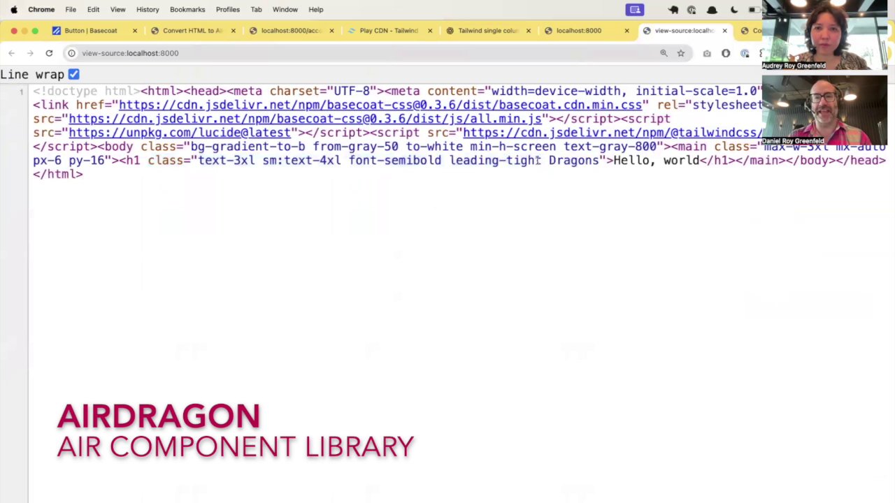
While the defaults are designed to be useful, you're not locked into them. You can easily append your own classes. If we want to add a Dragons class, we just pass it in.
ad.H1("Hello World", class_="Dragons")
(Note: he doesn't know why he capitalized it. He says he did so in the heat of the moment. You can lowercase your class names if that feels better. I think I would. Unless the same thing happened to me while recording a video.)
AirDragon intelligently appends your class (case-sensitively, yeah) to the existing list, giving you the power to extend the base styles.
Screenshot at [02:10]:
Of course, if you want complete control and none of AirDragon's default styling, you can always fall back to the standard Air components:
# This will have no default AirDragon styles
air.h1("Hello World", class_="dragons")
Building with Components: A Practical Example
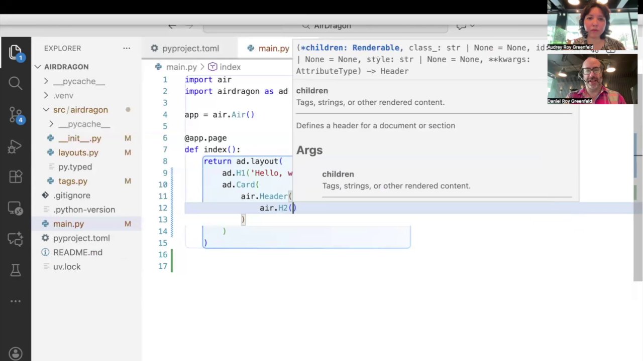
The real power of AirDragon comes from its collection of higher-level components like cards, buttons, and headers. Let's build a simple card to see it in action.
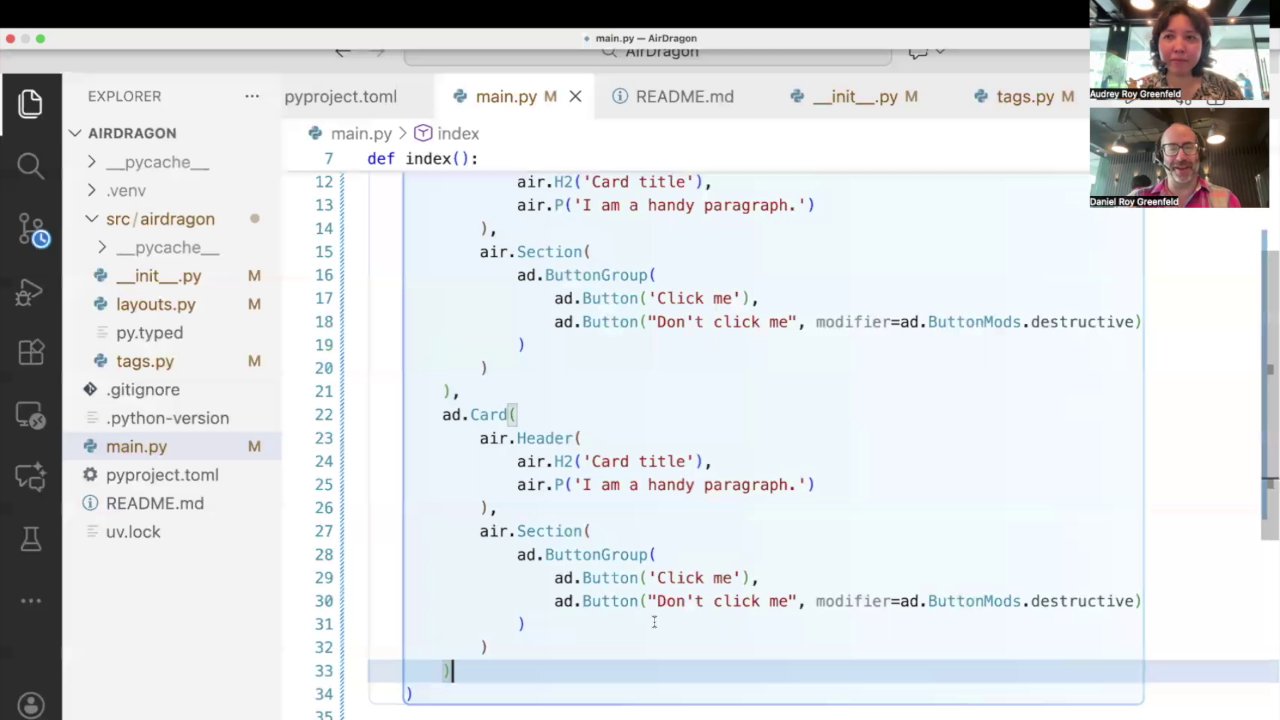
A card in AirDragon is structured with a Header, Section, and an optional Footer.
# ... inside air.layout()
ad.Card(
    ad.Header(
        ad.H2("Card Title")
    ),
    ad.Section(
        # Card content goes here...
    )
)
Screenshot at [03:25]:
Adding Buttons and Variants
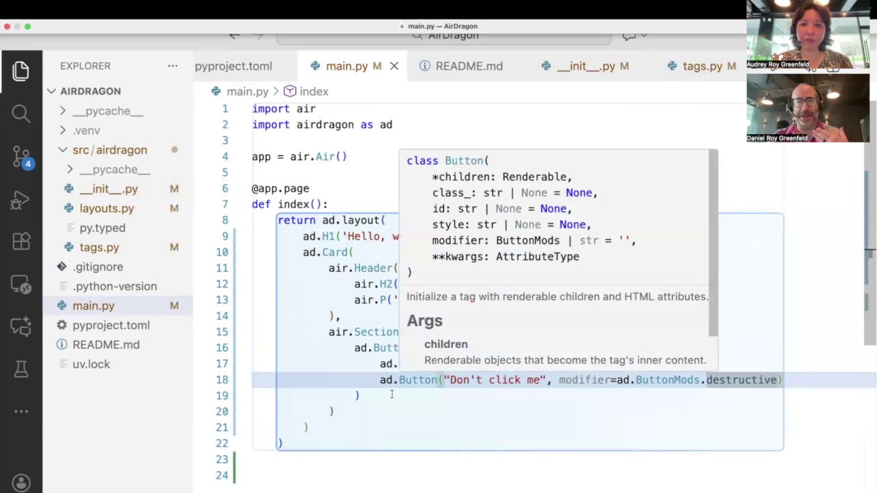
Now, let's add some actions to our card. AirDragon includes a ButtonGroup component for laying out buttons, and Buttons come with different variants. This is similar to patterns in other UI frameworks where you have primary, secondary, or destructive actions.
Here, we'll add a standard button and a "destructive" variant, which is styled in red to indicate a potentially dangerous action.
# ... inside the ad.Section()
ad.ButtonGroup(
    ad.Button("Save Changes"),
    ad.Button("Delete", class_="destructive")
)
Screenshot at [05:05]:
Putting it all together, we get a clean, well-structured card component with just a few lines of Python.
Screenshot at [06:20]:
Under the Hood and the Broader Ecosystem
AirDragon is built on top of Basecoat, which is a port of the popular Shadcn/ui from the React ecosystem to plain HTML and CSS. This provides a solid and modern design foundation for our components. But it's not just Basecoat for Air, it's more like Basecoat + whatever we think looks good.
The Air component ecosystem is still young and growing. There are several great projects exploring different patterns. If you're looking for alternatives, you might also check out Isaac Flath's work on EidosUI. It's an exciting time with lots of innovation happening.
What's Next
AirDragon is still in its very early stages. As we saw during the live demo, some things are still being built and refined. For example, creating a grid of cards requires a bit more layout work.
Screenshot at [07:40]:
Our focus is on hashing out the core UI and establishing simple, straightforward defaults that empower developers to build things quickly. We believe AirDragon can be a valuable tool for anyone looking to create beautiful, component-driven user interfaces with Air. We're excited to see where it goes.